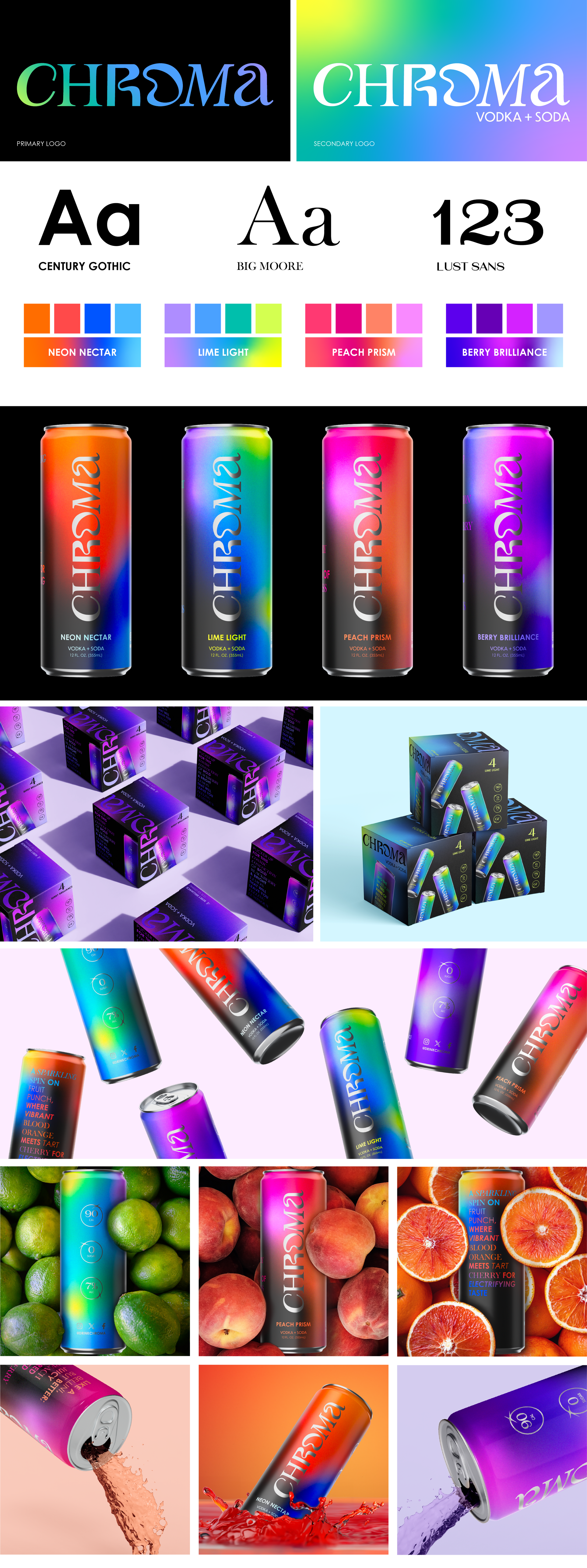
Chroma-Packaging Design
This project was made in collaboration with Mertz Design Studio. It was a semester long packaging design project during my fall co-op with them! Their guidance and continuous help along the way helped make Chroma what it is today. I learned countless lessons from the team and grew in my skills in the graphic design field through this project! Thank you Mertz!
-
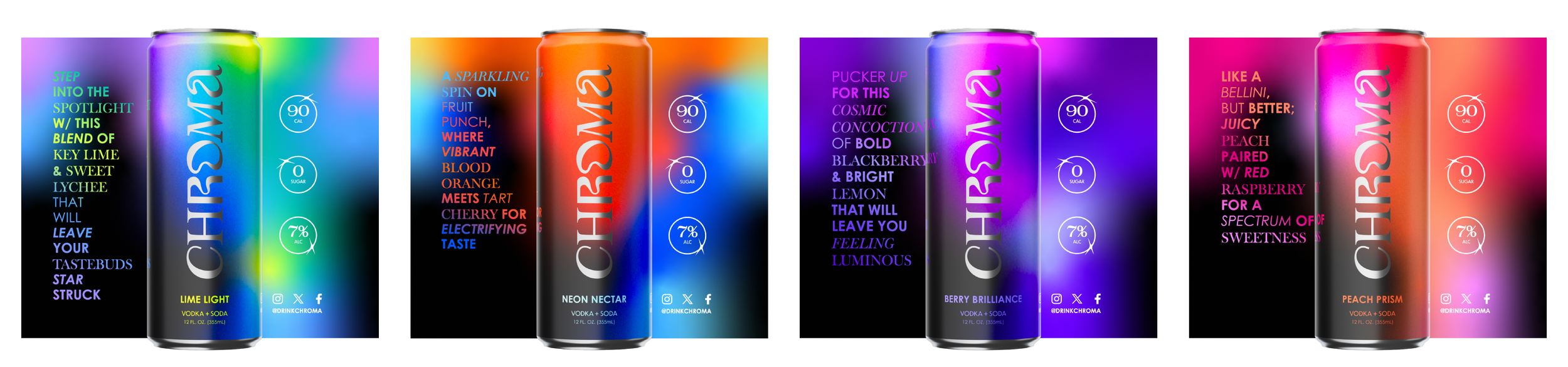
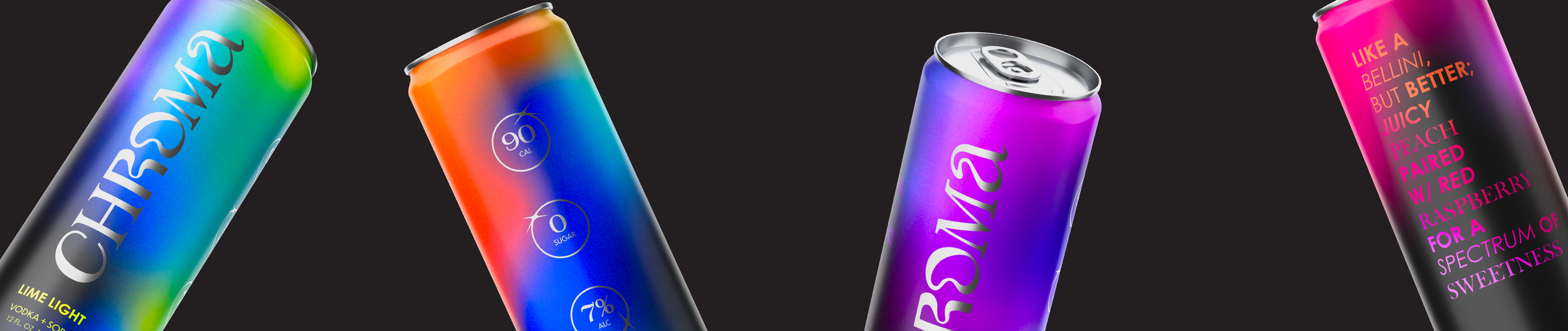
Chroma is a canned vodka soda drink, with flavors and packaging inspired by the well known Blink festival of art and light in Cincinnati, Ohio. This festival showcases the work from talented artists and is a memorable experience for all who attend.
-
This project involved a lot of research in various ways. Below is a list of some of the topics and areas I spent time learning about.
Local festivals/events: We wanted to center the inspiration for the drink brand around a local festival. The final three came down to Blink, Flying Pig Marathon, and Oktoberfest.
Alcohol labelling requirements: This included some visits to the store to see how real alcoholic beverage brands display information on their packaging
Trending graphic design styles: What font styles and treatments are on trend? How are colors being popularized currently?
-
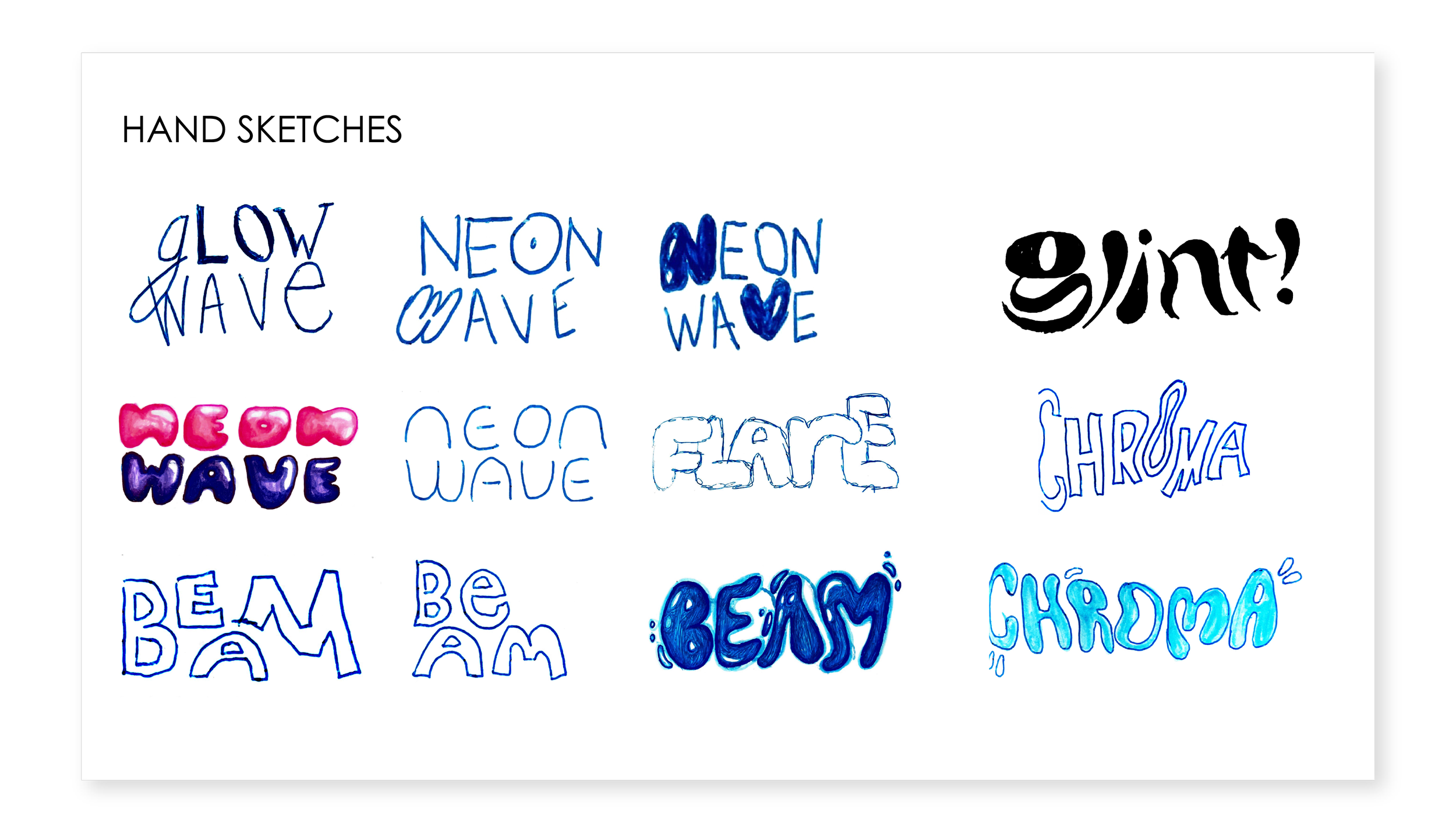
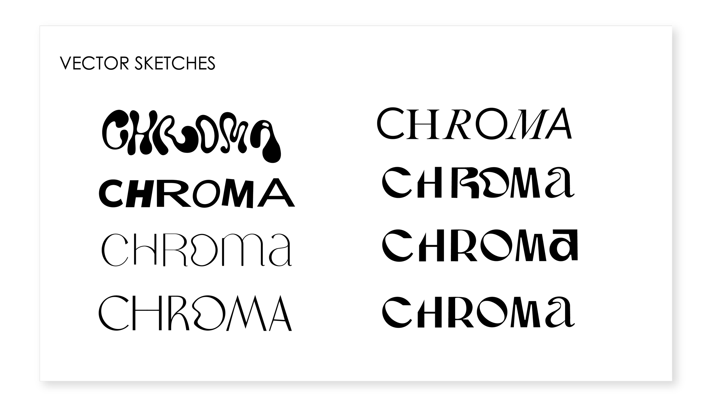
In most of my projects, I begin with looking for typography inspiration then move into some hand sketching. While these sketches are never perfect, I love getting ideas out on paper and working them out in front of me. Following that, I moved into Illustrator to explore more logo possibilities.
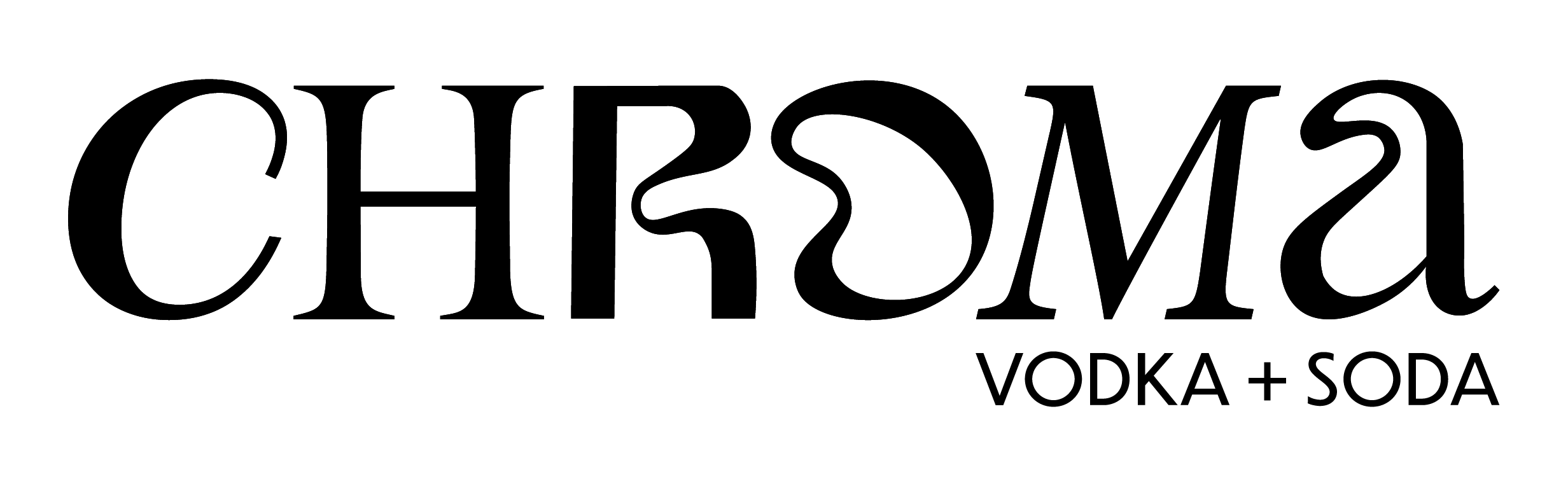
I spent a lot of time playing around with names for this project as well as flavor names. The final names were created and chosen to be on topic for the festival of art and light. This theme was considered all the way down to the flavor descriptions on each can. Their witty nature help bring a lighthearted energy to the brand.