Life is Beautiful - Music Festival Redesign
-
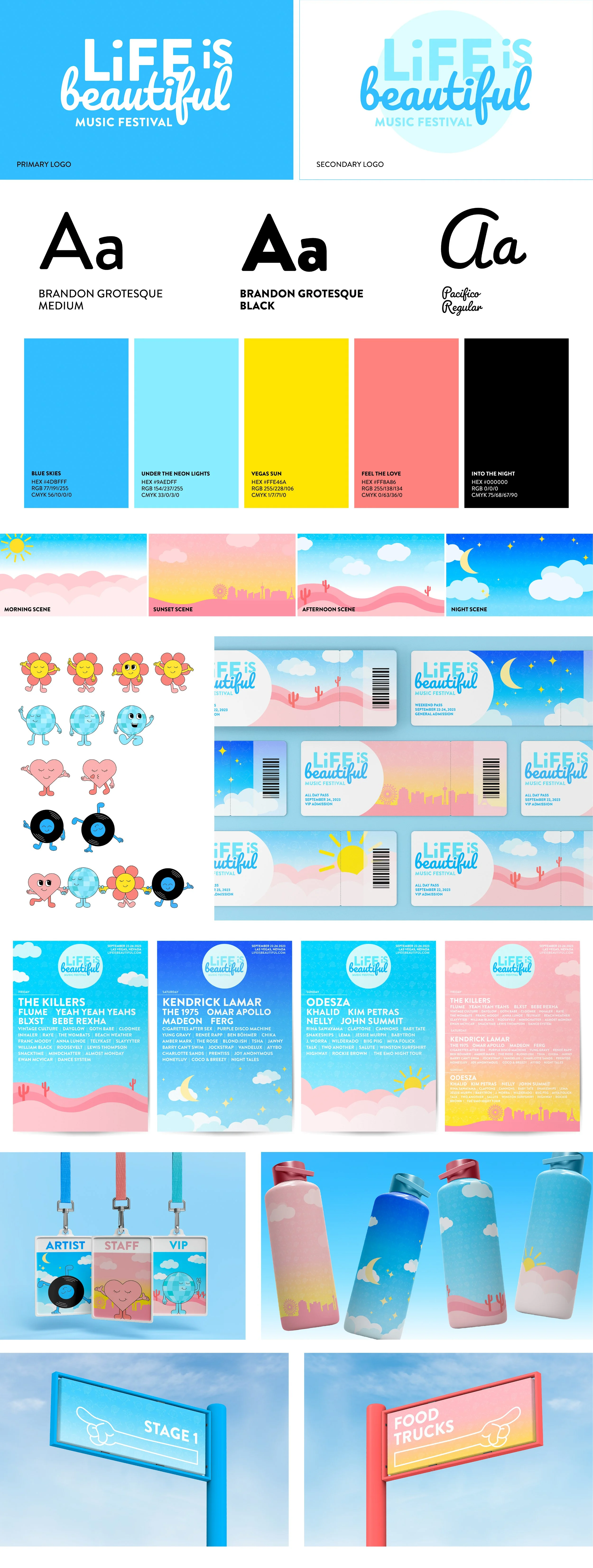
For this project, I was tasked with redesigning the branding for a festival of choice. I chose Life is Beautiful because I saw room for growth in the storytelling of the brand itself. What inspired me was the actual words in the festival title and I created an upbeat and lively brand to match that.
-
The process began with doing a competitor audit of similar music festivals as well as research on Life is Beautiful and its history. Next came creating a logo for the festival, which involved many stages of hand sketching, iterating on Illustrator, and testing color options. After finalizing a logo choice I moved on to create a brand identity which I expanded into touchpoints for the festival.
Current Brand Identity
The festival updates their branding each year but always keeps the roots of the same logo.
-
Through hand sketching, I was able to determine the combination of a sans serif font along with a script font. I chose Pacifico for the word “beautiful” and manipulated it for a more seamless look.
-
When iterating, I played around with having imagery in the logo but in the end chose to let the words speak for themselves. This allowed me to employ more imagery and color in the rest of the branding. I knew I wanted to create characters for this project in one way or another. They went through many drafts but I am so pleased with their final version!
Let’s get into the redesign!
Music by Reneé Rapp, a featured singer from the 2023 lineup


